Kamala Harris unveiled her campaign logo hours after Biden’s exit. Political graphic designers deconstruct the meaning behind it
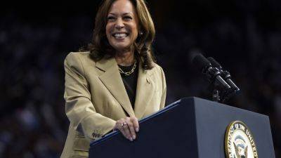
At Kamala Harris’ first event as a 2024 presidential candidate on Monday, the signs bearing the “Harris for President” logo were so fresh the Advance team had to run the still-wet placards straight from the printers to the Wilmington campaign headquarters.
The design was nearly as new. Less than an hour after Joe Biden announced his departure from the presidential race on Sunday afternoon, the redesign began with a call out on Slack to see which staff were available.
“The Harris for President creative and web teams sprang into action, rebranded the entire campaign overnight, and launched a new website in just 26 hours,” Harris for President Creative Director Kate Conway told The Independent. “There’s really no overselling how difficult a task that is.”
The creative team — mostly made up of women and led by women — designed six different new logo options. They narrowed it down to two, and then shared it with Harris’ team for final sign off.
The new logo sports the same Americana red, white, and blue color scheme and Decimal typeface featured in the Biden-Harris campaign, linking it visually to the brand identity and the historical record of the Biden presidency.
But it’s not totally identical: the Biden logo made the “E” in his surname reminicest of the stripes of the American flag. The Harris campaign instead highlighted the “for” in her new slogan with red, meaning that the eyes initially read the logo as “Harris President,” as if declaring it so.
When asked for their honest review, fellow designers tell The Independent that the Harris campaign is effectively using design cues in the new logo — even if it’s not the most thrilling.
“It’s not breaking any new design conventions,” Eric Krueger, founder of the
Related News